Making of: Visualizing the Excel table data
Tools used: Pen/Paper, Spreadsheet, Vector illustration software
A client has requested some help with visualizing the table data. It is the collection of responses from the focus group, about the importance of brand values and brand statements, along with their performance.
Here's the data in it's glorious form. There are two main columns: Performance and Importance. Each column then is divided into sub-columns that include categories like age group, occupation, etc. We'll start by focusing on the two columns highlighted in yellow.
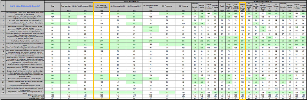
To keep things simple, instead of creating one huge chart that includes all the information at once, we've agreed to create a chart for each category. This way, viewers can compare the trend across the age groups, occupations, and other categories.
Here's the chart in Excel:

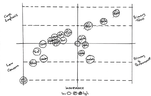
Alright, looks like we have an initial idea on how to go ahead with this. Off to the sketchboard!
You can see some of the sketches of the process. The goal is to simplify the whole thing, and make sure copy is legible and it's easy to place each finding within the chart:

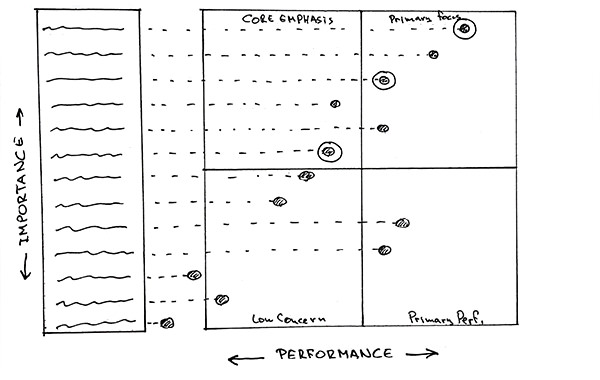

Hmm. Looks like the circular version of the chart communicates the information easier and cleaner than the rest. Here's the digital draft:
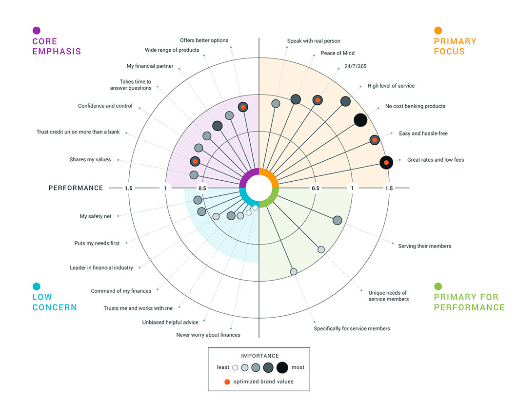
So far so good. Let's add some colour and details to finalize the graphic.
